

Part 8 -Building Your AI-Ready Data Stack: Build Predictive analytics model
10-part series about building your first Data stack from 0 to 1, and be ready for AI implementation.

Hello Readers!
In our last article, we explained different types of analytics models. Now, we're going to put that knowledge into action by building a predictive analytics model using a method called RFM analysis. Don't worry if you're feeling a bit overwhelmed – we're going to break this down step by step, explaining every detail along the way.
This one will be very hands on article, so buckle up, prepare your python environment and let’s get coding!
What We're Building (and Why It Matters)
Before we dive into the code, let's talk about what we're actually building and why it matters. We're creating a model that predicts customer behavior for an online retail business. This model will help us answer two critical questions:
Which customers are likely to make a purchase in the next 90 days?
How much are these customers likely to spend?
Why does this matter?
Imagine you're running an online store. If you could predict which customers are likely to buy soon, you could send them targeted promotions at just the right time. Or if you could identify customers who might be slipping away, you could take action to win them back before it's too late. That's the power of predictive analytics!
The Dataset
We'll be using a dataset that looks like this:
index | InvoiceNo | StockCode | Description | Quantity | InvoiceDate | UnitPrice | CustomerID | Country | date
Each row in this dataset represents a single transaction. Here's what each column means:
index: A unique identifier for each row in our dataset.InvoiceNo: A unique number assigned to each transaction.StockCode: A code assigned to each product.Description: A text description of the product.Quantity: The number of units of the product purchased in this transaction.InvoiceDate: The date and time when the transaction occurred.UnitPrice: The price of a single unit of the product.CustomerID: A unique identifier for each customer.Country: The country where the transaction originated.
This dataset is our crystal ball - the historical data that will help us peer into the future of customer behavior.
Step 1: Download the Dataset
First things first, we need to get our hands on the data. For this tutorial, we're using the Online Retail dataset, which is publicly available. You can download it from the UCI Machine Learning Repository here.
Once you've downloaded the dataset, save it somewhere easy to access on your computer. Remember the location – we'll need it when we start coding!
Step 2: Set Up Your Python Environment
We'll be using Python for this project. If you haven't already, you'll need to install Python and a few libraries. Don't worry, I'll walk you through it!
Install Python from python.org
Open your terminal or command prompt
Install the required libraries by typing:
pip install pandas numpy scikit-learn xgboost matplotlib seabornThis command installs:
pandas: For data manipulation and analysis
numpy: For numerical computing
scikit-learn: For machine learning tools
xgboost: For our predictive model
matplotlib and seaborn: For data visualization
Step 3: Load and Explore the Data
Now that we have our data and our tools, let's start exploring! We'll use pandas, a powerful data manipulation library in Python.
import pandas as pd
import matplotlib.pyplot as plt
import seaborn as sns

# Load the data
df = pd.read_excel('path_to_your_dataset/Online Retail.xlsx')

# Take a peek at the first few rows
print(df.head())

# Get some basic information about the dataset
print(df.info())

# Display summary statistics
print(df.describe())

# Check for missing values
print(df.isnull().sum())

# Visualize customer purchase trend over the year
plt.figure(figsize=(15, 6))
df.groupby(df['date'].dt.to_period('M'))['TotalAmount'].sum().plot(kind='bar')
plt.title('Monthly Total Purchase Amount')
plt.xlabel('Month')
plt.ylabel('Total Amount')
plt.xticks(rotation=45)
plt.tight_layout()
plt.show()
Let's break down what this code does:
We import the necessary libraries: pandas for data manipulation, and matplotlib and seaborn for visualization.
We load the data using
pd.read_excel(). Make sure to replace 'path_to_your_dataset/Online Retail.xlsx' with the actual path where you saved the dataset.We use
df.head()to display the first few rows of the dataset. This gives us a quick look at what our data looks like.df.info()provides a summary of the dataset, including column names, data types, and non-null counts. This helps us identify any missing data or unexpected data types.df.describe()generates descriptive statistics of the numerical columns. This includes count, mean, standard deviation, minimum, maximum, and quartile values.We check for missing values using
df.isnull().sum(). This tells us how many null values are in each column.Finally, we create histograms of the 'Quantity' and 'UnitPrice' columns to visualize their distributions. This can help us identify any outliers or unusual patterns in our data.

Action item:
When you run this code, take some time to really look at the output. Ask yourself:
Do the data types make sense for each column?
Are there any missing values? If so, how many and in which columns?
What's the range of values for Quantity and UnitPrice? Are there any surprising values?
Are people buying more items in November vs December ? (Pre holiday shopping ? Black friday deals ?)
Understanding your data is crucial before you start any analysis. It helps you identify potential issues and gives you a sense of what to expect from your results.
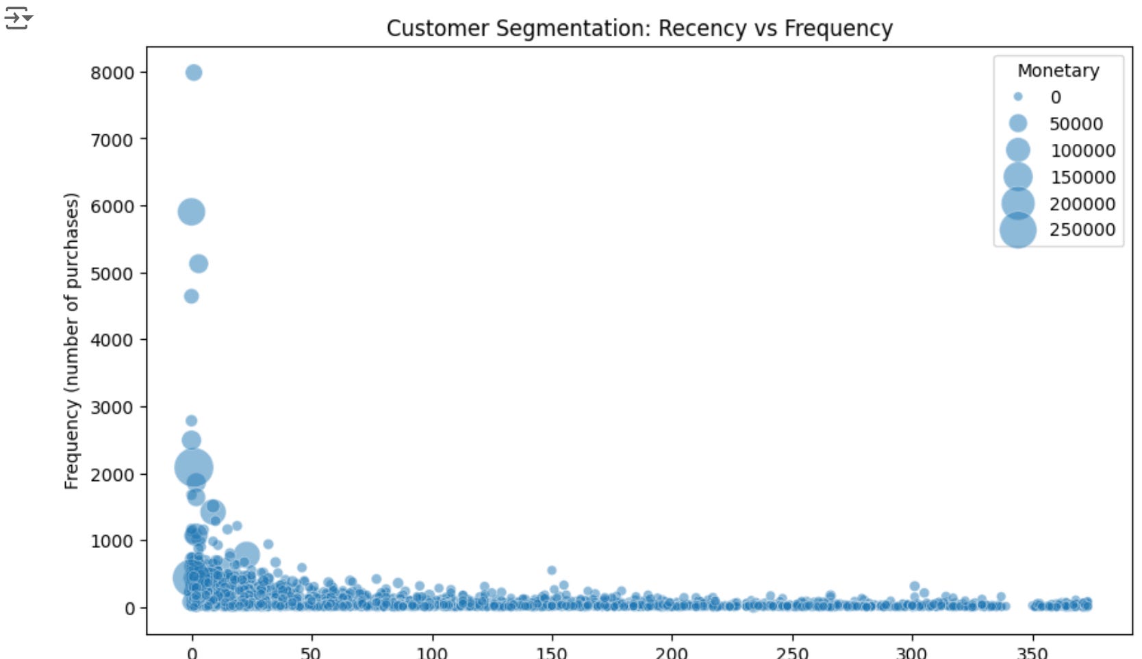
Step 4: What is RFM?
Before we go further, let's talk about RFM. It stands for Recency, Frequency, and Monetary value. It's a method used to analyze customer behavior and segment customers based on their purchasing habits.
Recency: How recently did the customer make a purchase? This is typically calculated as the number of days since the customer's last purchase.
Frequency: How often does the customer make purchases? This is usually the total number of purchases the customer has made.
Monetary Value: How much does the customer spend? This is typically the total amount the customer has spent.
RFM analysis is based on the idea that customers who have purchased recently, who buy frequently, and who spend more are more likely to purchase again. It's like the "three musketeers" of customer behavior prediction!
Here's why each component is important:
Recency: Recent customers are more likely to be engaged with your brand and to purchase again. They're also more likely to respond to your marketing efforts.
Frequency: Customers who buy often are showing a clear interest in your products. They're more likely to continue buying and may be good candidates for loyalty programs.
Monetary Value: Customers who spend more are obviously valuable to your business. They may be more likely to try new products or respond to upselling efforts.
By combining these three factors, RFM analysis gives us a powerful tool for understanding and predicting customer behavior.
Step 5: Prepare the Data for RFM Analysis
Now that we understand RFM, let's prepare our data for analysis. We need to calculate these three values for each customer. This process involves several steps, so let's break it down:
import pandas as pd
from datetime import datetime

# Convert 'InvoiceDate' to datetime if it's not already
df['InvoiceDate'] = pd.to_datetime(df['InvoiceDate'])

# Calculate total purchase amount for each transaction
df['TotalAmount'] = df['Quantity'] * df['UnitPrice']

# Set the analysis date as the day after the last transaction date
analysis_date = df['InvoiceDate'].max() + pd.Timedelta(days=1)

# Group by customer and calculate RFM metrics
rfm = df.groupby('CustomerID').agg({
    'InvoiceDate': lambda x: (analysis_date - x.max()).days,  # Recency
    'InvoiceNo': 'count',  # Frequency
    'TotalAmount': 'sum'  # Monetary
})

# Rename columns
rfm.columns = ['Recency', 'Frequency', 'Monetary']

# Display the first few rows of the RFM dataframe
print(rfm.head())

# Display summary statistics of the RFM dataframe
print(rfm.describe())

# Visualize the distributions of R, F, and M
fig, (ax1, ax2, ax3) = plt.subplots(1, 3, figsize=(20,5))
sns.histplot(rfm['Recency'], ax=ax1)
ax1.set_title('Distribution of Recency')
sns.histplot(rfm['Frequency'], ax=ax2)
ax2.set_title('Distribution of Frequency')
sns.histplot(rfm['Monetary'], ax=ax3)
ax3.set_title('Distribution of Monetary Value')
plt.show()
Let's break down what this code does:
We start by ensuring our 'InvoiceDate' column is in datetime format. This allows us to perform date calculations.
We calculate the total purchase amount for each transaction by multiplying Quantity by UnitPrice.
We set our analysis date as the day after the last transaction in our dataset. This ensures our recency calculation is up-to-date.
We use the
groupby()function to group our data by CustomerID, then calculate our RFM metrics:Recency: We subtract the date of the customer's last purchase from our analysis date.
Frequency: We count the number of invoices for each customer.
Monetary: We sum the total amount spent by each customer.
We rename our columns for clarity.
We display the first few rows of our RFM dataframe and its summary statistics.
Finally, we visualize the distributions of our RFM values.
Action Item:
When you run this code, pay attention to the output:
Look at the summary statistics. What's the average recency, frequency, and monetary value? What about the minimum and maximum values?
Examine the distributions in the histograms. Are they normally distributed, or skewed? Are there any outliers?
Understanding these characteristics of your RFM values is crucial for the next steps in our analysis.
Step 6: Prepare for Machine Learning
Now that we have our RFM values, we're ready to start building our predictive model. But first, we need to do a bit more preparation. This involves several important steps:
Handling any remaining missing values or outliers
Splitting our data into training and testing sets
Scaling our features
Let's go through these steps one by one:
import numpy as np
from sklearn.model_selection import train_test_split
from sklearn.preprocessing import StandardScaler

# 1. Handle missing values and outliers
# Check for any remaining missing values
print(rfm.isnull().sum())

# If there are any missing values, we can handle them like this:
rfm = rfm.dropna()

# Handle outliers by capping at 99th percentile
for column in rfm.columns:
    max_val = rfm[column].quantile(0.99)
    rfm[column] = rfm[column].clip(upper=max_val)

# 2. Split the data into features (X) and target (y)
X = rfm[['Recency', 'Frequency']]
y = rfm['Monetary']

# Split into training and testing sets
X_train, X_test, y_train, y_test = train_test_split(X, y, test_size=0.2, random_state=42)

# 3. Scale the features
scaler = StandardScaler()
X_train_scaled = scaler.fit_transform(X_train)
X_test_scaled = scaler.transform(X_test)

# Print the shape of our training and testing sets
print("Training set shape:", X_train_scaled.shape)
print("Testing set shape:", X_test_scaled.shape)

# Visualize the scaled features
fig, (ax1, ax2) = plt.subplots(1, 2, figsize=(15,5))
sns.scatterplot(x=X_train_scaled[:,0], y=X_train_scaled[:,1], ax=ax1)
ax1.set_title('Scaled Training Features')
ax1.set_xlabel('Scaled Recency')
ax1.set_ylabel('Scaled Frequency')
sns.scatterplot(x=X_test_scaled[:,0], y=X_test_scaled[:,1], ax=ax2)
ax2.set_title('Scaled Testing Features')
ax2.set_xlabel('Scaled Recency')
ax2.set_ylabel('Scaled Frequency')
plt.show()
Let's break down what this code does:
Handling missing values and outliers:
We first check for any remaining missing values in our RFM dataframe.
If there are missing values, we drop those rows. In a real-world scenario, you might want to handle missing values differently depending on your specific situation.
We handle outliers by capping values at the 99th percentile. This is a simple way to deal with extreme values that might skew our model.
Splitting the data:
We separate our features (X) and target variable (y). Here, we're using Recency and Frequency to predict Monetary value.
We use sklearn's
train_test_splitfunction to split our data into training and testing sets. We're using 80% of our data for training and 20% for testing.
Scaling the features:
We use StandardScaler to scale our features. This is important because our features (Recency and Frequency) are on very different scales, which can cause problems for some machine learning algorithms.
We fit the scaler on our training data and then use it to transform both our training and testing data.
After these steps, we print the shapes of our training and testing sets to confirm the split, and we visualize our scaled features to see how they're distributed.

When you run this code, pay attention to:
Any missing values in the RFM dataframe
The shapes of your training and testing sets
The distribution of your scaled features in the scatter plots
These visualizations can help you spot any remaining issues with your data before you start building your model.
Step 7: Build and Train the Model
Now we're ready for the exciting part - building our predictive model! We'll use XGBoost, a powerful machine learning algorithm that often performs very well on this type of data. But first, let's talk about what XGBoost is and how it works.
What is XGBoost?
XGBoost stands for "Extreme Gradient Boosting". It's an implementation of gradient boosted decision trees designed for speed and performance. Here's a breakdown of what that means:
Decision Trees: These are models that make predictions by following a series of if-then statements. They're like a game of 20 questions - the model asks a series of yes/no questions about the features to arrive at a prediction.
Gradient Boosting: This is a technique where we build many decision trees sequentially, with each new tree trying to correct the errors of the previous trees. It's like a team of experts, where each expert specializes in handling the cases that the previous experts got wrong.
Extreme: XGBoost includes several optimizations that make it extremely fast and effective, especially for structured/tabular data like we're working with.
XGBoost works by starting with a simple model and then iteratively adding new models to correct the errors of the existing models. Each new model focuses on the examples that the current set of models performs poorly on. This process continues until the model reaches a specified number of iterations or until the predictions stop improving.
Step 7: Build and Train the Model
Now that we understand what XGBoost is, let's implement it in our predictive model:
from xgboost import XGBRegressor
from sklearn.metrics import mean_absolute_error, mean_squared_error, r2_score
import numpy as np

# Create and train the model
model = XGBRegressor(random_state=42)
model.fit(X_train_scaled, y_train)

# Make predictions
train_predictions = model.predict(X_train_scaled)
test_predictions = model.predict(X_test_scaled)

# Evaluate the model
def evaluate_model(y_true, y_pred):
    mae = mean_absolute_error(y_true, y_pred)
    rmse = np.sqrt(mean_squared_error(y_true, y_pred))
    r2 = r2_score(y_true, y_pred)
    return mae, rmse, r2

train_mae, train_rmse, train_r2 = evaluate_model(y_train, train_predictions)
test_mae, test_rmse, test_r2 = evaluate_model(y_test, test_predictions)

print("Training Set Metrics:")
print(f"Mean Absolute Error: ${train_mae:.2f}")
print(f"Root Mean Squared Error: ${train_rmse:.2f}")
print(f"R-squared Score: {train_r2:.4f}")

print("\nTest Set Metrics:")
print(f"Mean Absolute Error: ${test_mae:.2f}")
print(f"Root Mean Squared Error: ${test_rmse:.2f}")
print(f"R-squared Score: {test_r2:.4f}")

# Visualize actual vs predicted values
plt.figure(figsize=(10, 6))
plt.scatter(y_test, test_predictions, alpha=0.5)
plt.plot([y_test.min(), y_test.max()], [y_test.min(), y_test.max()], 'r--', lw=2)
plt.xlabel("Actual Monetary Value")
plt.ylabel("Predicted Monetary Value")
plt.title("Actual vs Predicted Monetary Value")
plt.show()
Let's break down what this code does:
We create an XGBRegressor model. We're using the default parameters here, but in a real-world scenario, you might want to tune these parameters to optimize performance.
We train the model using our scaled training data.
We use the trained model to make predictions on both our training and test data.
We define a function
evaluate_modelthat calculates three common regression metrics:Mean Absolute Error (MAE): The average absolute difference between predicted and actual values.
Root Mean Squared Error (RMSE): The square root of the average of squared differences between prediction and actual values.
R-squared (R2) Score: A measure of how well the model explains the variance in the target variable.
We calculate these metrics for both our training and test sets.
Finally, we create a scatter plot of actual vs predicted values on our test set. The red dashed line represents perfect predictions.

When you run this code, pay close attention to the output metrics and the visualization:
How do the metrics compare between the training and test sets? If they're very different, this could indicate overfitting.
In the scatter plot, how closely do the points follow the red dashed line? Points that are far from this line represent predictions that were significantly off.
Step 8: Interpret the Results
Now that we have our model and its performance metrics, let's interpret what they mean:
Mean Absolute Error (MAE): This tells us, on average, how far off our predictions are in dollars. For example, if the MAE is $50, it means our predictions are off by $50 on average.
Root Mean Squared Error (RMSE): Similar to MAE, but penalizes large errors more heavily. It's always larger than or equal to MAE.
R-squared Score: This tells us what percentage of the variance in the target variable our model explains. An R-squared of 0.7, for example, means our model explains 70% of the variance in the monetary value.
If our model is performing well, we should see:
Similar MAE and RMSE values between the training and test sets
R-squared values that are reasonably high (what's considered "high" can vary by field, but above 0.5 is often considered decent for complex real-world data)
Points in the scatter plot that generally follow the red dashed line
Step 9: Feature Importance
One of the advantages of using XGBoost is that it can tell us which features were most important in making predictions. Let's examine this:
# Get feature importance
importance = model.feature_importances_
feature_names = X.columns

# Create a dataframe of feature importances
feature_importance = pd.DataFrame({'feature': feature_names, 'importance': importance})
feature_importance = feature_importance.sort_values('importance', ascending=False)

# Visualize feature importances
plt.figure(figsize=(10, 6))
sns.barplot(x='importance', y='feature', data=feature_importance)
plt.title('Feature Importance')
plt.show()
This code extracts the feature importances from our model, creates a dataframe with this information, and then visualizes it as a bar plot.
When you look at this plot, consider:
Which feature (Recency or Frequency) seems to be more important in predicting Monetary value?
Does this align with your business intuition? Why or why not?
Step 10: Making Predictions on New Data
Now that we have a trained model, we can use it to make predictions on new data. Here's how you might do that:
# Let's say we have some new customer data
new_customers = pd.DataFrame({
    'Recency': [5, 10, 15],
    'Frequency': [100, 50, 25]
})

# Scale the new data using the same scaler we used for training
new_customers_scaled = scaler.transform(new_customers)

# Make predictions
new_predictions = model.predict(new_customers_scaled)

# Add predictions to the dataframe
new_customers['Predicted_Monetary'] = new_predictions

print(new_customers)
This code demonstrates how you could use your model to predict the monetary value for new customers based on their recency and frequency values.
Wrapping Up: You've Built Your First Predictive Model!
Congratulations! You've just built your first predictive analytics model using RFM analysis and XGBoost. Let's recap what we've accomplished:
We loaded and explored our data, gaining insights into its structure and characteristics.
We learned about RFM analysis and prepared our data accordingly.
We preprocessed our data, handling missing values, outliers, and scaling our features.
We split our data into training and testing sets to properly evaluate our model.
We built and trained an XGBoost model to predict customer monetary value.
We evaluated our model using various metrics and visualizations.
We interpreted the results, including examining feature importance.
We demonstrated how to use the model to make predictions on new data.
This is just the beginning of what you can do with predictive analytics.
From here, you could:
Experiment with different features or feature engineering techniques
Try other machine learning algorithms and compare their performance
Use your model to segment customers based on their predicted monetary value
Develop targeted marketing strategies based on your predictions
Remember, the power of predictive analytics isn't just in building models - it's in using those insights to make better business decisions. Think about how you could use these predictions in your business:
Could you use them to identify high-value customers for special promotions?
Could you target customers with low predicted monetary value for win-back campaigns?
How might you adjust your inventory or staffing based on predicted customer spending?
Next steps
In our next article, we'll deploy this model to production. Until then, keep exploring, keep questioning, and keep pushing the boundaries of what's possible with your data!
Happy predicting !